How To Add Date Range Picker In Angular 15 Material
Websolutionstuff | Jun-30-2023 | Categories : Angular
In this tutorial, I will guide you through the process of adding a date range picker component to your Angular 15 application using Angular Material. The date range picker is a powerful tool that allows users to select a range of dates conveniently, making it ideal for applications that involve date-based operations such as event scheduling, booking systems, and data analysis tools.
By leveraging the capabilities of Angular Material, we can seamlessly integrate a date range picker into our application and enhance the user experience.
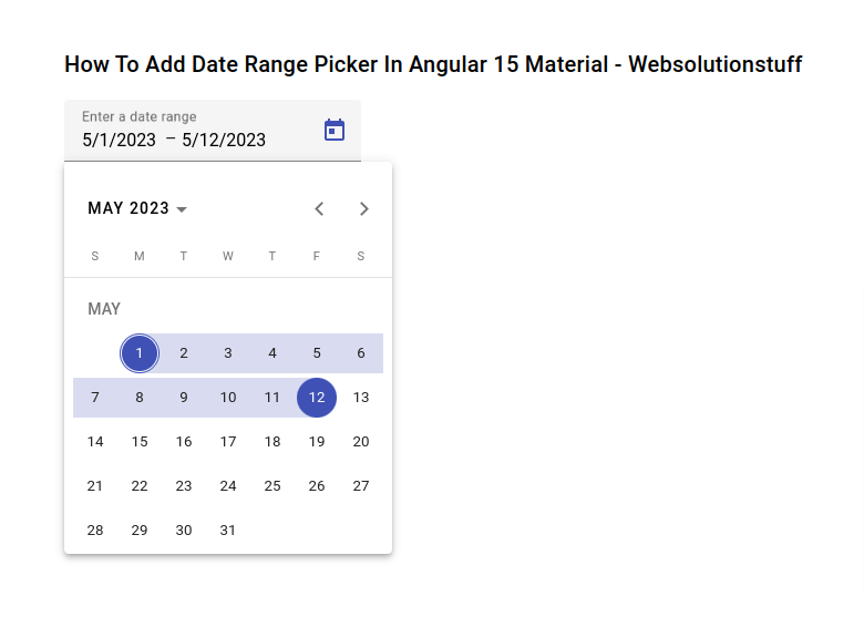
If you want your users to select a range of dates, instead of a single date, you can use the mat-date-range-input and mat-date-range-picker components.
Throughout this tutorial, we will take a step-by-step approach to incorporate the date range picker component into your Angular 15 application. We will cover installation, module imports, component implementation, customization options, event handling, and styling techniques.
Table of Contents:
- Prerequisites
- Install Angular Material
- Import Angular Material Modules
- Add Date Range Picker Component
- Customize Date Range Picker Options
- Handle Date Range Selection
- Run Angular Application
- Conclusion
By the end of this tutorial, you will have a solid understanding of how to integrate a date range picker using Angular Material in your Angular 15 application.
So, let's dive in and explore how to enhance your application with a feature-rich and intuitive date range picker component using Angular Material in Angular 15.
Before we begin, make sure you have a working Angular 15 application set up on your machine. Additionally, ensure that you have the necessary dependencies installed, including Angular Material and its associated CSS styles.
To add Angular Material to your project, run the following command in your terminal:
npm install @angular/material@15 @angular/cdk@15
Import the required Angular Material modules in your application's module file (app.module.ts):
import { NgModule } from '@angular/core';

import { BrowserModule } from '@angular/platform-browser';

import { AppComponent } from './app.component';

import { BrowserAnimationsModule } from '@angular/platform-browser/animations';

import { MatDatepickerModule } from '@angular/material/datepicker';

import { MatNativeDateModule } from '@angular/material/core';

import { MatFormFieldModule } from '@angular/material/form-field';

import { ReactiveFormsModule } from '@angular/forms';


@NgModule({

  declarations: [

    AppComponent

  ],

    imports:      [

    BrowserModule,

    BrowserAnimationsModule,

    MatDatepickerModule,

    MatNativeDateModule,

    MatFormFieldModule,

    ReactiveFormsModule ],

  providers: [],

  bootstrap: [AppComponent]

})

export class AppModule { }
Ensure that you also import the necessary Angular Material CDK modules.
In your desired component template, add the date range picker component.
src/app/app.component.html
<div class="container">
<h1>How To Add Date Range Picker In Angular 15 Material - Websolutionstuff</h1>

<mat-form-field appearance="fill">
	<mat-label>Enter a date range</mat-label>
	<mat-date-range-input [rangePicker]="picker">
		<input matStartDate placeholder="Start date">
		<input matEndDate placeholder="End date">
	</mat-date-range-input>
	<mat-hint>MM/DD/YYYY – MM/DD/YYYY</mat-hint>
	<mat-datepicker-toggle matIconSuffix [for]="picker"></mat-datepicker-toggle>
	<mat-date-range-picker #picker></mat-date-range-picker>
</mat-form-field>
</div>
Output:

You can customize the date range picker by configuring its options. For example, you can set the minimum and maximum selectable dates:
<mat-date-range-picker [startAt]="startDate" [endAt]="endDate"></mat-date-range-picker>
In your component file, define the start and end dates:
startDate: Date;
endDate: Date;

constructor() {
  this.startDate = new Date(2023, 0, 1);
  this.endDate = new Date(2023, 11, 31);
}
To capture the selected date range, you can bind to the (dateChange) event:
<mat-date-range-picker (dateChange)="onDateRangeSelected($event)"></mat-date-range-picker>
Start the Angular development server using the ng serve command and open the app in your browser.
ng serve
By following this step-by-step guide, you have learned how to add a date range picker component to your Angular 15 application using Angular Material.
You have explored customization options, event handling, and styling techniques for the date range picker. With this knowledge, you can enhance your application by allowing users to select date ranges effortlessly.
The date range picker component adds significant value to applications that require date range selection, such as booking systems, event calendars, and data analysis tools.
You might also like:
- Read Also: Bootstrap Modal In Angular 13
- Read Also: Laravel 8 Form Class Not Found
- Read Also: Laravel 8 Datatables Filter with Dropdown
- Read Also: Laravel 8 User Roles and Permissions Without Package
Recommended Post
Featured Post

How To Check Image Blur Or Not...
In this article, we will see how to check image blur or not using python. For blur image check we are using the OpenCV p...
May-13-2022

How to Install Jenkins on Ubun...
In today's fast-paced software development landscape, I've understood the significance of continuous integration...
Aug-07-2023

Laravel 9 Form Collective Exam...
In this article, we will see laravel 9 form collective example. Here, we will learn how to use collective form and...
Jan-20-2023

Laravel 11 Livewire Dependent...
Hello, laravel web developers! In this article, we'll see how to create a dependent dropdown in laravel 11 Livewire....
Jun-03-2024