How To Add Bootstrap 5 Modal In Laravel 10
Websolutionstuff | Apr-12-2023 | Categories : Laravel PHP Bootstrap
In this article, we will see how to add the bootstrap 5 modal in laravel 10. Here, we will learn about the bootstrap 5 modal example. Use Bootstrap’s JavaScript modal plugin to add dialogs to your site for lightboxes, user notifications, or completely custom content.
Modals are built with HTML, CSS, and JavaScript. They’re positioned over everything else in the document and remove the scroll from the <body> so that modal content scrolls instead.
So, let's see, laravel 10 bootstrap 5 modal examples, bootstrap 5 modal popup, bootstrap 5 modal form, how to use bootstrap 5 modal in laravel 10, bootstrap 5 modal jquery, and bootstrap modal js cdn.
<!doctype html>
<html lang="en">
<head>
<!-- Required meta tags -->
<meta charset="utf-8">
<meta name="viewport" content="width=device-width, initial-scale=1">
<!-- Bootstrap CSS -->
<link href="https://cdn.jsdelivr.net/npm/[email protected]/dist/css/bootstrap.min.css" rel="stylesheet">
<title>How To Add Bootstrap 5 Modal In Laravel 10 - Websolutionstuff</title>
</head>
<body>
<div class="container mt-5">
<h4>How To Add Bootstrap 5 Modal In Laravel 10 - Websolutionstuff</h4>
<!-- Button trigger modal -->
<button type="button" class="btn btn-primary" data-bs-toggle="modal" data-bs-target="#exampleModal">
Click Here
</button>
<!-- Modal -->
<div class="modal fade" id="exampleModal" tabindex="-1" aria-labelledby="exampleModalLabel" aria-hidden="true">
<div class="modal-dialog">
<div class="modal-content">
<div class="modal-header">
<h5 class="modal-title" id="exampleModalLabel">Modal title</h5>
<button type="button" class="btn-close" data-bs-dismiss="modal" aria-label="Close"></button>
</div>
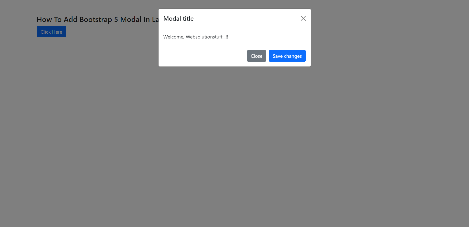
<div class="modal-body">
Welcome, Websolutionstuff...!!
</div>
<div class="modal-footer">
<button type="button" class="btn btn-secondary" data-bs-dismiss="modal">Close</button>
<button type="button" class="btn btn-primary">Save changes</button>
</div>
</div>
</div>
</div>
</div>
<!-- Option 1: Bootstrap Bundle with Popper -->
<script src="https://cdn.jsdelivr.net/npm/[email protected]/dist/js/bootstrap.bundle.min.js"></script>
<!-- Option 2: Separate Popper and Bootstrap JS -->
<!--
<script src="https://cdn.jsdelivr.net/npm/@popperjs/[email protected]/dist/umd/popper.min.js" integrity="sha384-IQsoLXl5PILFhosVNubq5LC7Qb9DXgDA9i+tQ8Zj3iwWAwPtgFTxbJ8NT4GN1R8p" crossorigin="anonymous"></script>
<script src="https://cdn.jsdelivr.net/npm/[email protected]/dist/js/bootstrap.min.js" integrity="sha384-cVKIPhGWiC2Al4u+LWgxfKTRIcfu0JTxR+EQDz/bgldoEyl4H0zUF0QKbrJ0EcQF" crossorigin="anonymous"></script>
-->
</body>
</html>
Output:
When the backdrop is set to static, the modal will not close when clicking outside it.
<!-- Button trigger modal -->
<button type="button" class="btn btn-primary" data-bs-toggle="modal" data-bs-target="#staticBackdrop">
  Launch static backdrop modal
</button>

<!-- Modal -->
<div class="modal fade" id="staticBackdrop" data-bs-backdrop="static" data-bs-keyboard="false" tabindex="-1" aria-labelledby="staticBackdropLabel" aria-hidden="true">
  <div class="modal-dialog">
    <div class="modal-content">
      <div class="modal-header">
        <h5 class="modal-title" id="staticBackdropLabel">Modal title</h5>
        <button type="button" class="btn-close" data-bs-dismiss="modal" aria-label="Close"></button>
      </div>
      <div class="modal-body">
        ...
      </div>
      <div class="modal-footer">
        <button type="button" class="btn btn-secondary" data-bs-dismiss="modal">Close</button>
        <button type="button" class="btn btn-primary">Understood</button>
      </div>
    </div>
  </div>
</div>
When modals become too long for the user’s viewport or device, they scroll independently of the page itself.
You can also create a scrollable modal that allows scrolling the modal body by adding .modal-dialog-scrollable to .modal-dialog.
<!-- Scrollable modal -->
<div class="modal-dialog modal-dialog-scrollable">
  ...
</div>
Add .modal-dialog-centered to .modal-dialog to vertically center the modal.
<!-- Vertically centered modal -->
<div class="modal-dialog modal-dialog-centered">
  ...
</div>

<!-- Vertically centered scrollable modal -->
<div class="modal-dialog modal-dialog-centered modal-dialog-scrollable">
  ...
</div>
You might also like:
- Read Also: Bootstrap Modal In Angular 13
- Read Also: How To Reset Modal Form In jQuery
- Read Also: Bootstrap Daterangepicker Example
- Read Also: Laravel 10 Select2 Autocomplete Search Using Ajax
Recommended Post
Featured Post

Autocomplete Search from Datab...
Hello, laravel web developers! In this article, we'll see how to autocomplete a search from a database in larav...
Jun-24-2024

Google Autocomplete Address In...
In this article, we will see the google autocomplete address in laravel 9. In laravel 8 google autocomplete address...
Apr-12-2022

Bootstrap Daterangepicker Exam...
In this small tutorial i will show you how to implement bootstrap daterangepicker example, bootstrap date rang...
May-17-2021

Laravel 9 whereColumn Query Ex...
In this article, we will see laravel 9 whereColumn() query example. The whereCoulmn method is used to verify whethe...
Oct-21-2022