How To Change Datepicker Color In Angular 15 Material
Websolutionstuff | Jul-05-2023 | Categories : Angular
In this tutorial, I will guide you through the process of changing the color of a datepicker component in Angular 15 Material. As developers, we understand the importance of customization and branding in creating a visually appealing user interface.
By modifying the color of the datepicker, we can seamlessly integrate it into our Angular 15 Material application and ensure it aligns with our desired color scheme and branding.
Throughout this tutorial, I will provide detailed explanations, code examples, and step-by-step instructions to help you change the color of the datepicker component in Angular 15 Material. We will cover the prerequisites, installation of Angular Material, module imports, component creation, and the actual process of modifying the datepicker color.
Table of Contents:
- Prerequisites
- Install Angular Material
- Import Angular Material Modules
- Create Datepicker Component
- Change Datepicker Color
- Conclusion
By the end of this tutorial, you will have a clear understanding of how to customize the color of the datepicker in Angular 15 Material, allowing you to create a visually consistent and attractive user interface.
So, let's get started and dive into the implementation steps of changing the color of the datepicker in your Angular 15 Material application.
Before we get started, make sure you have a working Angular 15 application set up on your machine. Additionally, ensure that you have the necessary dependencies installed, including Angular Material and its corresponding CSS styles.
To add Angular Material to your project, run the following command in your terminal.
npm install @angular/material@15 @angular/cdk@15
In the component file (app.module.ts), import the required Angular Material modules.
import { NgModule } from '@angular/core';

import { BrowserModule } from '@angular/platform-browser';

import { AppComponent } from './app.component';

import { BrowserAnimationsModule } from '@angular/platform-browser/animations';

import { MatDatepickerModule } from '@angular/material/datepicker';

import { MatNativeDateModule } from '@angular/material/core';

import { MatFormFieldModule } from '@angular/material/form-field';

import { ReactiveFormsModule } from '@angular/forms';


@NgModule({

  declarations: [

    AppComponent

  ],

    imports:      [

    BrowserModule,

    BrowserAnimationsModule,

    MatDatepickerModule,

    MatNativeDateModule,

    MatFormFieldModule,

    ReactiveFormsModule ],

  providers: [],

  bootstrap: [AppComponent]

})

export class AppModule { }
Create a new component that will contain your datepicker. For example, you can create a DatepickerComponent using the Angular CLI.
ng generate component Datepicker
In your DatepickerComponent a template file, add the datepicker component and modify it.
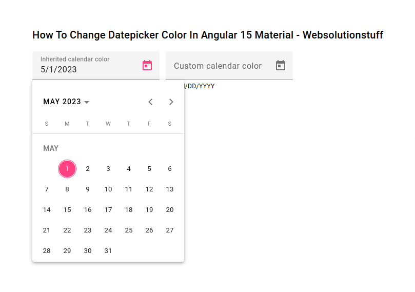
<div class="container" style="margin:70px;">
	<h2>How To Change Datepicker Color In Angular 15 Material - Websolutionstuff</h2>
	<mat-form-field color="accent" appearance="fill">
		<mat-label>Inherited calendar color</mat-label>
		<input matInput [matDatepicker]="picker1">
		<mat-hint>MM/DD/YYYY</mat-hint>
		<mat-datepicker-toggle matIconSuffix [for]="picker1"></mat-datepicker-toggle>
		<mat-datepicker #picker1></mat-datepicker>
	  </mat-form-field>

	  <mat-form-field color="accent" appearance="fill">
		<mat-label>Custom calendar color</mat-label>
		<input matInput [matDatepicker]="picker2">
		<mat-hint>MM/DD/YYYY</mat-hint>
		<mat-datepicker-toggle matIconSuffix [for]="picker2"></mat-datepicker-toggle>
		<mat-datepicker #picker2 color="primary"></mat-datepicker>
	  </mat-form-field>
</div>
In your DatepickerComponent class file.
import {Component} from '@angular/core';
import {MatDatepickerModule} from '@angular/material/datepicker';
import {MatFormFieldModule} from '@angular/material/form-field';
import {MatNativeDateModule} from '@angular/material/core';

/** @title Datepicker start date */
@Component({
  selector: 'app-datepicker',
  templateUrl: 'datepicker.component.html',
  standalone: true,
  imports: [MatFormFieldModule, MatDatepickerModule, MatNativeDateModule],
})
export class DatepickerComponent {}
Start the Angular development server using the ng serve command and open the app in your browser.
ng serve
Output:
By following this step-by-step guide, you have learned how to change the color of a datepicker component in Angular 15 Material. Customizing the color allows you to align the datepicker with your application's color scheme and branding, creating a cohesive and visually appealing user interface.
You might also like:
- Read Also: How To Change Datepicker Start Date In Angular 15
- Read Also: How To Setup 404 Page In Angular 12
- Read Also: How to Send Bulk Mail Using Queue in Laravel 8
- Read Also: How Generate PDF From HTML View In Laravel
Recommended Post
Featured Post

Laravel 9 Import Export CSV/EX...
In this tutorial, I will give you laravel 9 import export csv and excel file example. We will simply create import...
Feb-19-2022

Laravel 8 User Role and Permis...
In this post i will show you laravel 8 user role and permission with example, here we will see how to set user role and...
Jun-02-2021

Server Side Custom Search in D...
In this example we will discuss about server side custom search in datatable. Datatable provides default searching...
Apr-05-2021

How To Install php-bcmath In U...
In this article, I will guide you through the process of installing php-bcmath on Ubuntu. Php-bcmath is a PHP extension...
Jul-12-2023